院内到日常
呦呦是医院交给患者用的 AI 健康助手:医院采购后接进自己的公众号和小程序,推给在本院看过病的患者和他们的家人。功能上它对标蚂蚁阿福这类 C 端健康产品——对话提问、拍照解读报告、绑定设备、家庭档案;差别在数据和服务从哪里来。阿福的档案主要靠用户自己攒(拍照、绑设备、部分地区授权导入),呦呦要用的检验、门诊、住院记录本来就躺在医院系统里,患者授权同步,AI 给出的每条结论都能落回本院的科室、医生和随访安排。
所以它不是又做一个通用健康百科,而是把医院「看得见的诊疗」延长成「看不见的日常」:报告解读直接给出待就诊、待复查、需关注的分流;健康数据把院内指标和手环数据放进同一张卡片;血糖先选分型,再定目标和告警;档案可以对着手机说话修改。原则只有一条:患者不必懂医学术语,也知道下一步做什么。
Youyou is the AI health assistant a hospital hands to its own patients: the hospital licenses it, plugs it into its official account and mini program, and recommends it to people it has already treated and to their families. Feature-wise it follows consumer products such as Ant Afu — conversational questions, photo-based report reading, device syncing, family records. The difference is where the data and the service come from. Afu's archive is mostly assembled by the user through photos, wearables and, in some regions, an authorised import, whereas the labs, outpatient visits and admissions Youyou works with already sit inside the hospital system; once a patient authorises syncing, every conclusion can point back to a real department, a real doctor and a real follow-up arrangement.
So it is not another general health encyclopedia; it lengthens the part of care a hospital can see into the part it cannot. Report reading turns results into need-to-see-a-doctor, need-a-recheck and worth-watching. Vitals place in-hospital measurements and wearable data on the same card. Glucose asks for a diabetes type before it sets targets and alerts. The record can be changed by talking to the phone. One principle runs through all of it: a patient should never need the vocabulary of medicine to know what to do next, only a clear next step and someone to see.
| 场景 | 用户 | 价值 |
|---|---|---|
| 出院与术后随访、体检报告解读、慢病日常监测、家庭健康档案、可穿戴设备数据接入 | 本院就诊患者与家属、糖尿病与高血压人群、中老年用户、医院健康管理与随访团队 | 结论直接落到就诊与复查、数据与院内记录同源可追溯、一人管理全家、语音降低使用门槛 |
医生朋友
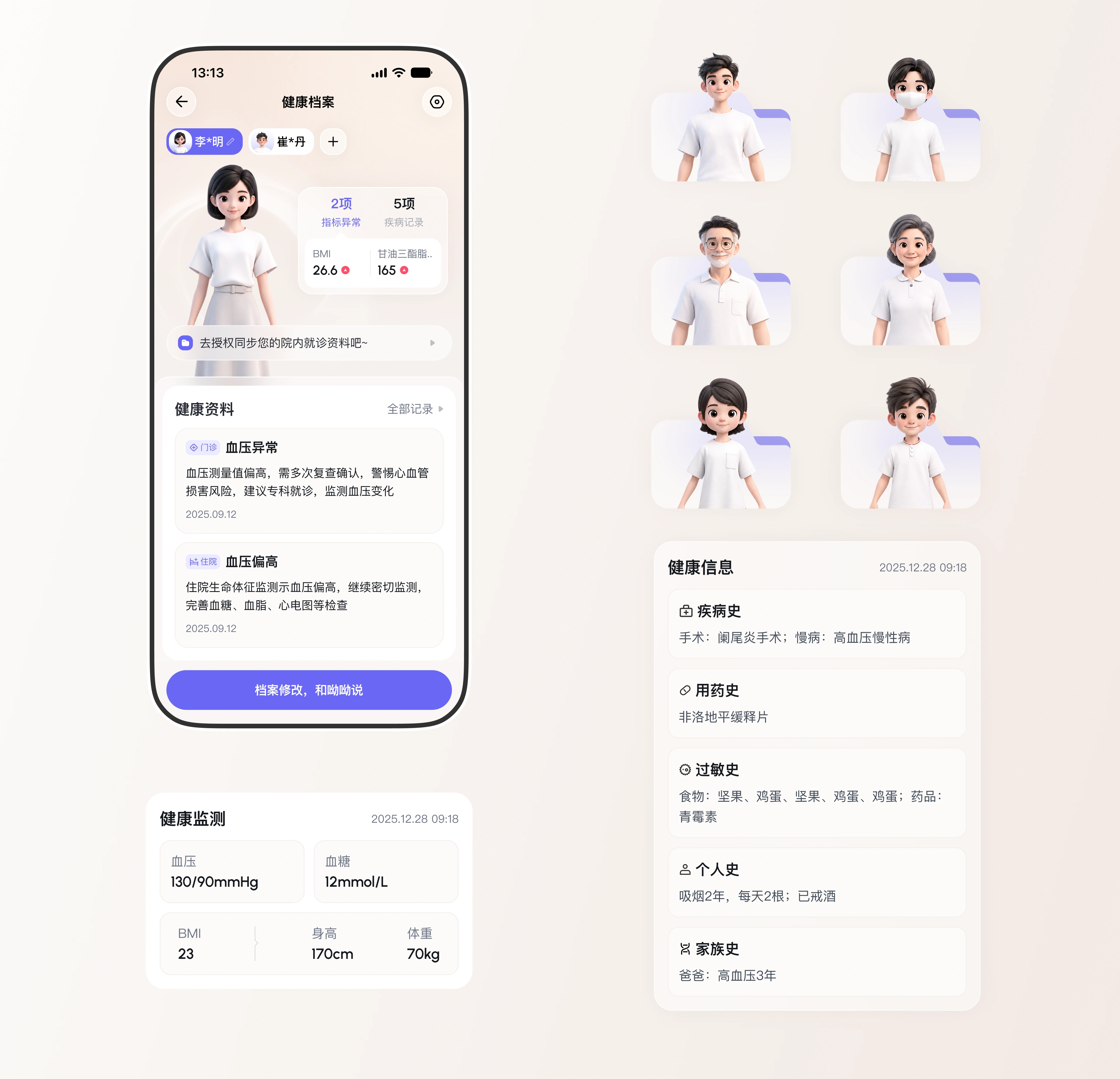
呦呦被画成一个穿白袍、挂听诊器、手里夹着病历夹的年轻女医生:圆脸、笑眼、3D 卡通,第一眼像门诊里那位愿意多说两句的医生,而不是一个搜索框。同一套 IP 还做了儿童、成年、老年三个年龄段共六个形象——档案里不只有使用者自己,给父母建档时,头像是那位老人,而不是一个默认灰头像。品牌紫只留给需要做决定的地方:打开、发送、绑定、AI 智能解读;其余界面用暖白和浅蓝,把医疗感降到最低。
Youyou is drawn as a young doctor in a white coat, stethoscope around the neck, chart in hand: round face, smiling eyes, soft 3D. The first impression should be the doctor in the clinic who is willing to explain one more time, not a search box. The same character was extended to six figures across child, adult and elderly, because an archive never holds only its owner — when a daughter creates a record for her mother, the avatar is that older woman, not a default grey silhouette. Brand purple is reserved for the places that require a decision: open, send, bind, interpret.

今日重点
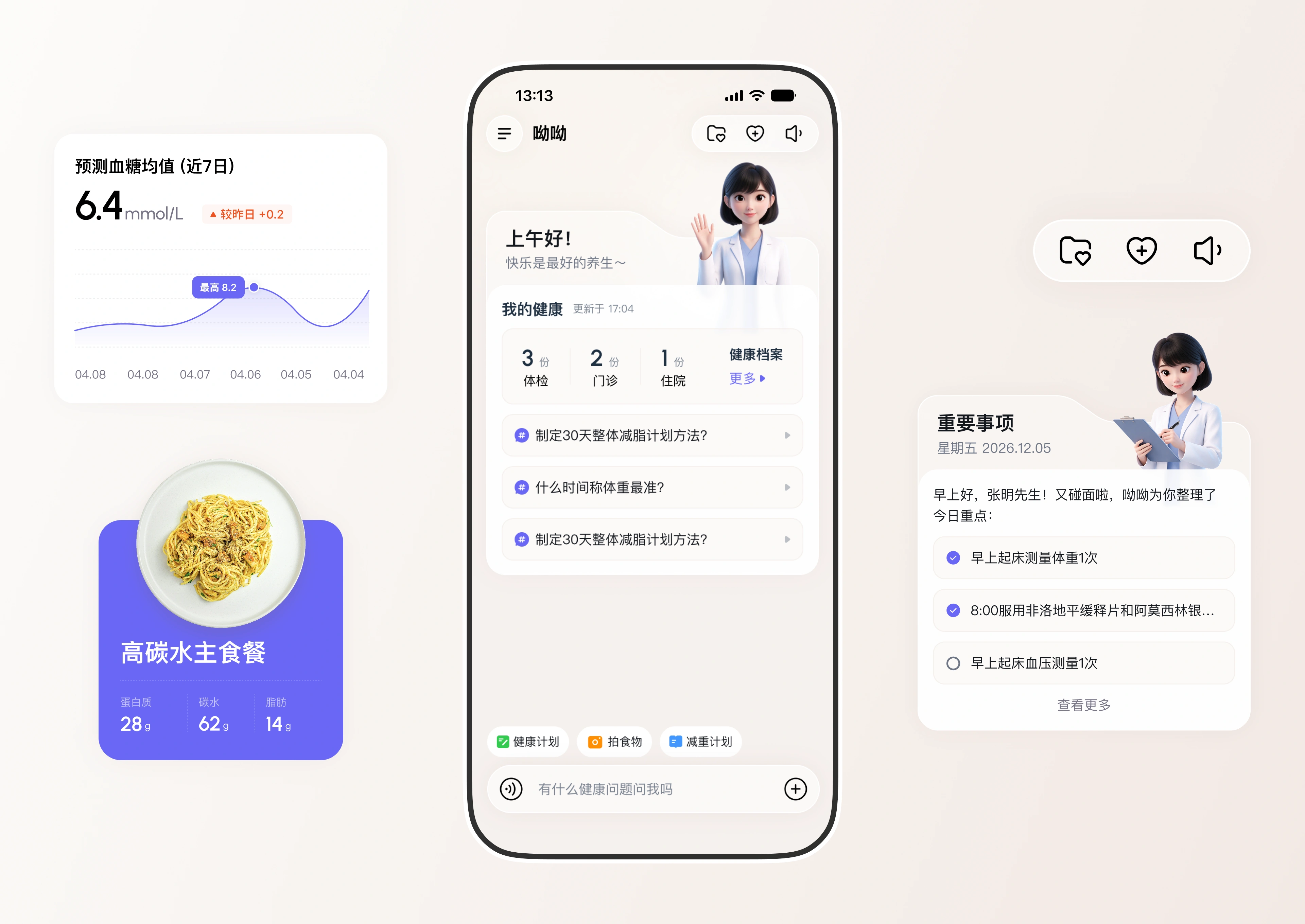
首页没有金刚区,第一屏只回答三件事:今天要做什么、身体怎么样、有问题怎么问。问候语下面直接是「我的健康」(体检 3、门诊 2、住院 1)和一串点开就能走的 AI 问题;中间是血糖预测、饮食营养和今日待办;底部是三个高频动作(健康计划、拍食物、减重计划)和常驻的语音输入框。血糖卡不只给一个 6.4,还标出「较昨日 +0.2」和近七日曲线——数字要能比较,才有意义;不能比较的数字,只是噪声。
There is no icon grid on the home screen. The first screen answers three things only: what to do today, how the body is doing, and how to ask. Under the greeting sit the health summary (three check-ups, two outpatient visits, one admission) and a set of AI questions that can be tapped and sent as they are; then glucose forecast, nutrition and today's to-dos; at the bottom, three frequent actions and a persistent voice input. The glucose card never shows a bare 6.4 — it also states plus 0.2 against yesterday and draws the last seven days, because a number only means something when it can be compared.
报告分流
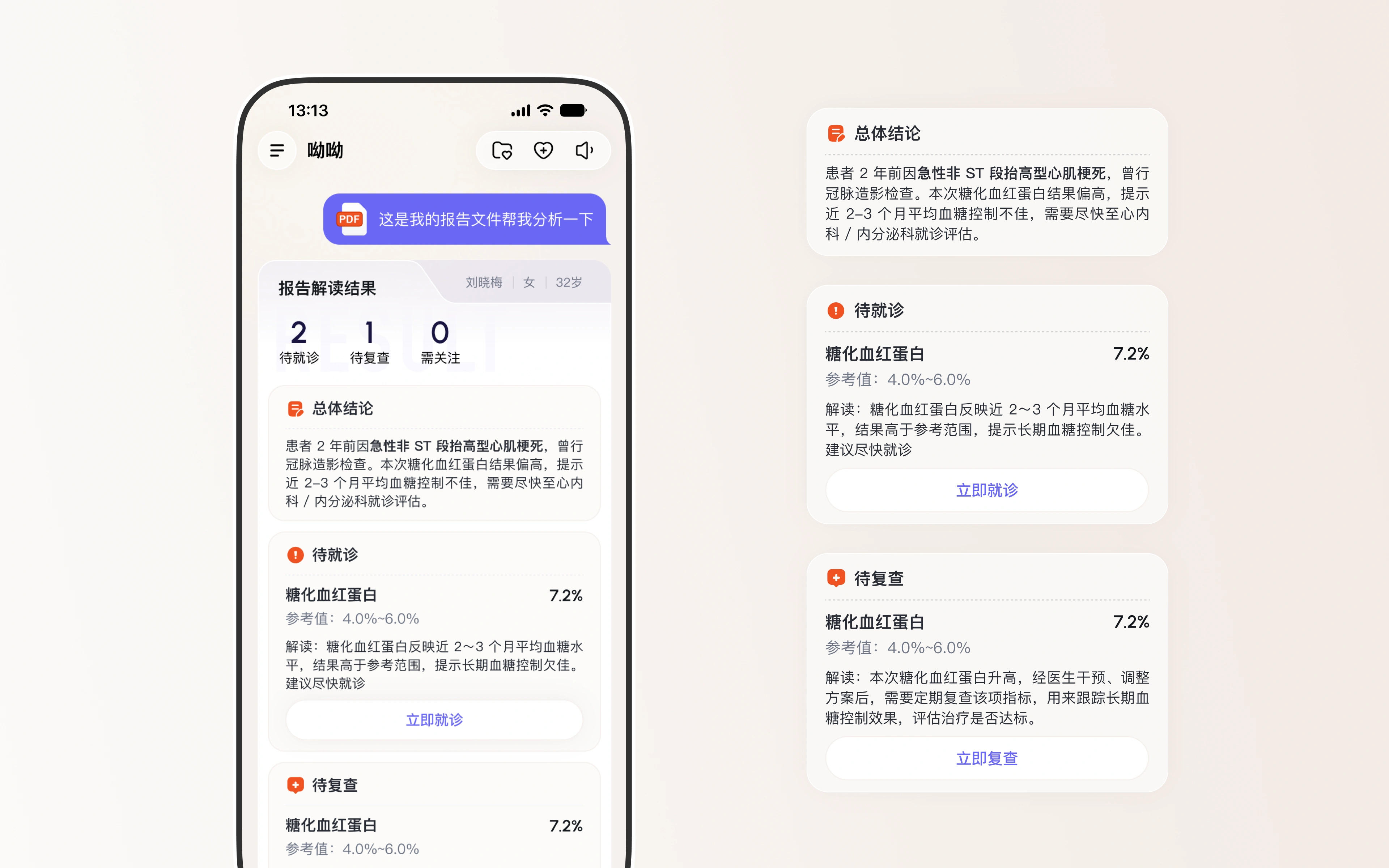
报告解读的产出不是一段解释,而是三个数字:待就诊 2、待复查 1、需关注 0。每条异常都带参考区间、一句人话解读和一个动作按钮——糖化血红蛋白 7.2%(参考 4.0–6.0%)配「立即就诊」,需要复查的项配「立即复查」。患者拿到的是一张排好序的待办清单;对医院,门诊结论就此变成依从性的入口。
The output of report reading is not a paragraph of explanation but three numbers: two things needing a visit, one needing a recheck, zero worth watching. Every abnormal value carries its reference range, one sentence in plain language and a button — HbA1c at 7.2 percent against a 4.0 to 6.0 range pairs with see a doctor now, while items that only need repeating pair with book a recheck. The patient leaves with a ranked to-do list instead of a denser report, and the hospital turns an outpatient conclusion into a reason to come back.
指标成卡
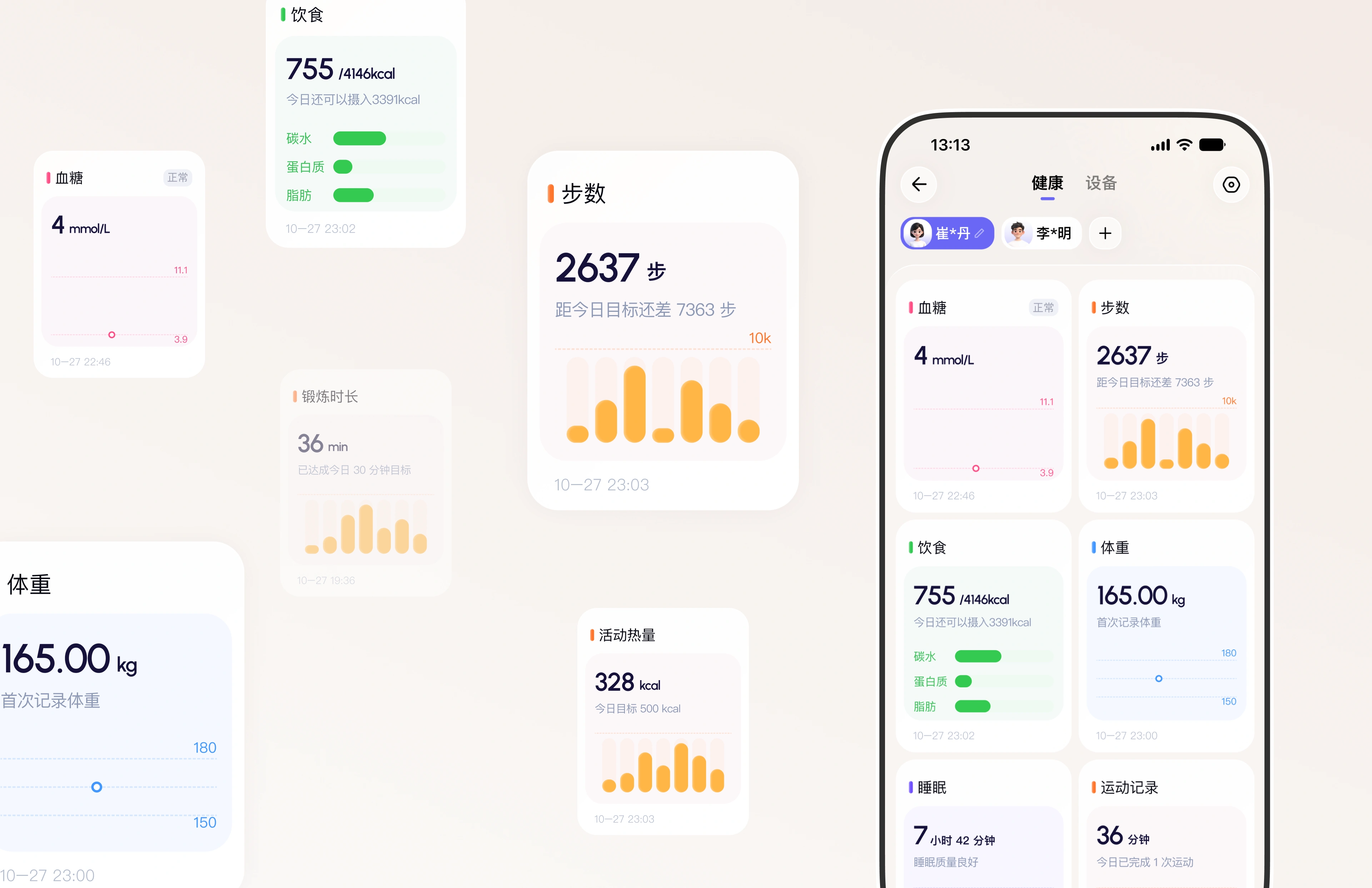
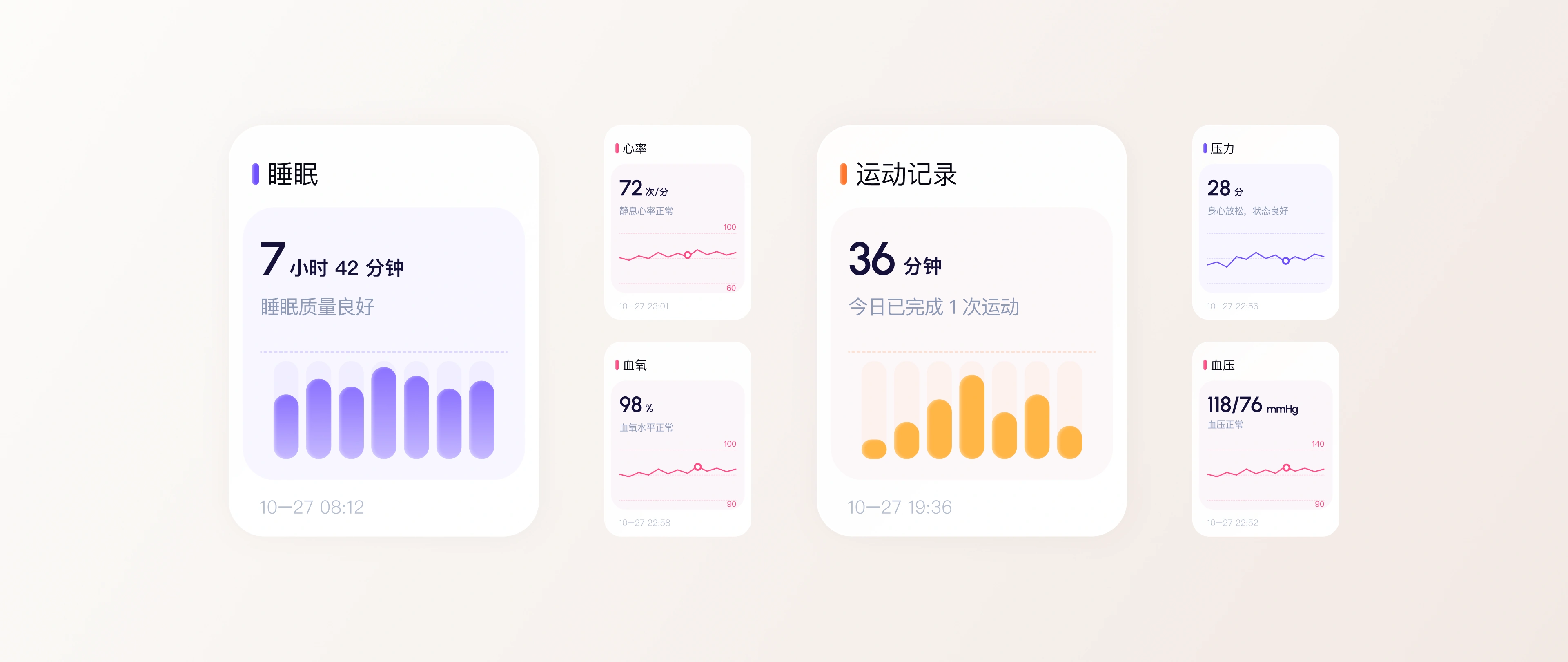
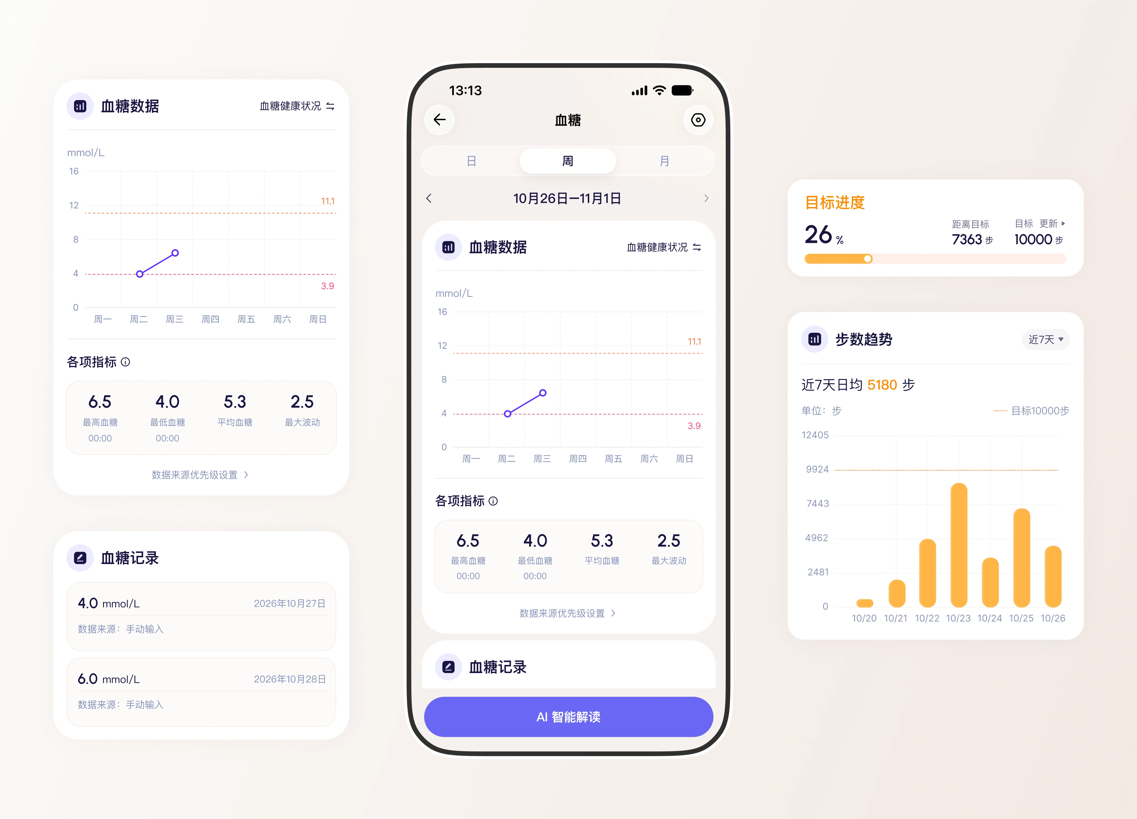
血糖、体重、饮食、步数、锻炼时长、睡眠、心率、血氧、压力、血压,被收进同一套卡片:一个大数字、一行状态判断、一条趋势。每张卡都带两个参照——目标(今日还可摄入 339 kcal、距目标还差 7363 步)和时间戳。顶部可切换成员,一部手机管全家;绑定设备与院内检验同套展示,患者不必分辨数据来源。
Glucose, weight, diet, steps, exercise minutes, active calories, sleep, heart rate, blood oxygen, stress and blood pressure share one card system: a large number, a one-line verdict, a trend. Each card carries two references — a goal (339 kcal still available today, 7,363 steps short of target) and a timestamp. Family members switch at the top, so one phone covers the whole household, and wearable readings sit beside in-hospital results in the same visual language; patients never have to work out which source they are looking at, or open two apps to see one picture.
一键绑定
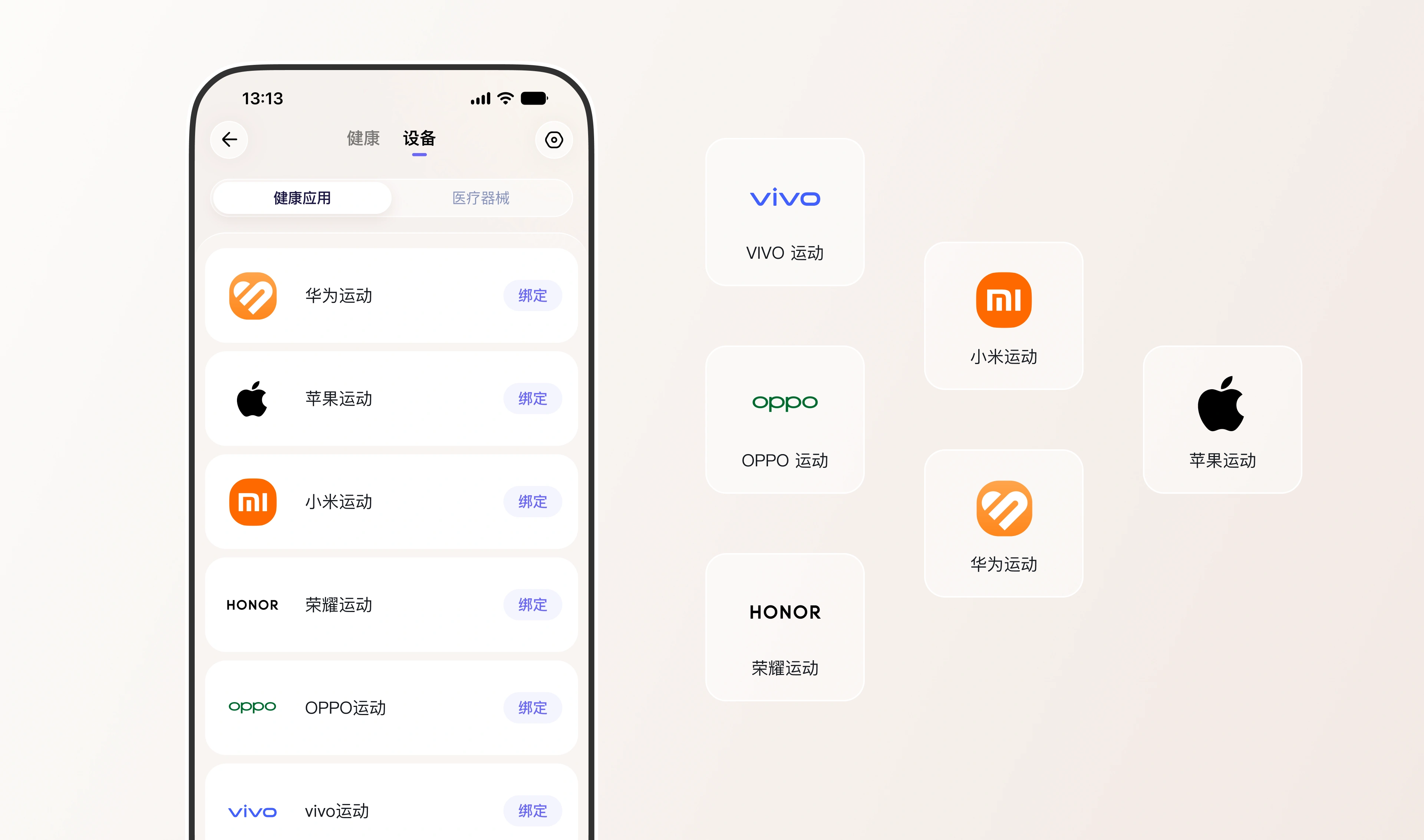
数据得先能进来。设备页分成「健康应用」和「医疗器械」两个 tab:前者一键绑定华为、苹果、小米、荣耀、OPPO、vivo 六家应用,后者留给血压计、血糖仪这类医院更认的器械。这是数据可信度的分水岭——手环的步数只算参考,血压计和血糖仪的读数才进得了随访判断,来源既要能区分,也要能设优先级。
Data has to get in first. The device page splits into health apps and medical devices: one tap binds Huawei, Apple, Xiaomi, Honor, OPPO or vivo health, while the second tab is kept for the blood-pressure monitors and glucose meters a hospital will actually trust. For the hospital this is the dividing line of credibility — step counts from a wristband are context, readings from a monitor or a meter can enter a follow-up judgement — so sources must be distinguishable and prioritised.
事件叠加
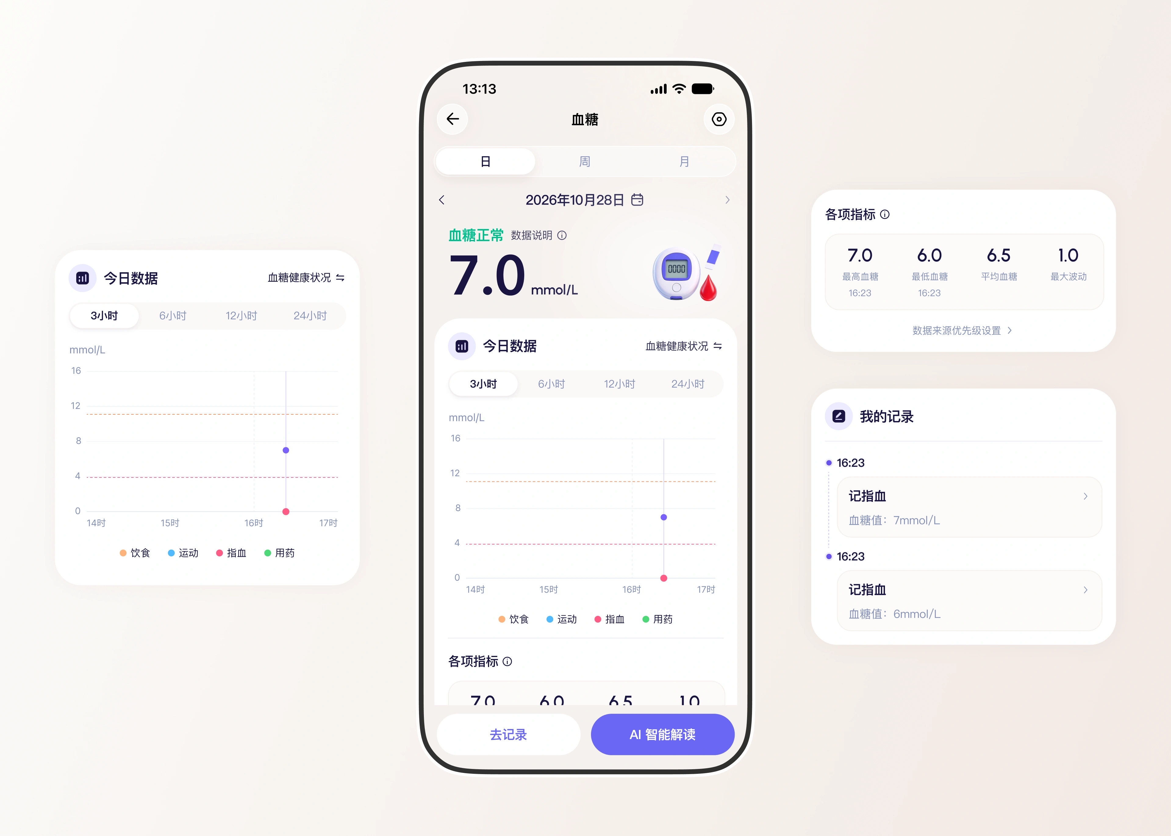
血糖页的重点在图上的几层信息:日、周、月三种跨度,3、6、12、24 小时窗口,3.9 和 11.1 两条阈值虚线,以及沿时间轴标出的饮食、运动、指血、用药四类事件。看到 16:23 升到 7.0 这一个点,还能看到前后吃了什么、动了多久、有没有吃药。下面四项指标(最高、最低、平均、最大波动)接「AI 智能解读」,把判断和建议一起给出来;记录入口同时保留手动补录,因为不是每个患者都戴设备。
The glucose screen is really about the layers on the chart: day, week and month spans, three, six, twelve and twenty-four hour windows, dashed thresholds at 3.9 and 11.1, and four kinds of events marked along the timeline — food, exercise, finger-prick readings and medication. Seeing 7.0 at 16:23 also means seeing what was eaten, how long the walk was and whether the dose was taken. Four summary figures — highest, lowest, average, largest swing — hand over to AI interpretation, and manual entry stays available at the bottom, because not every patient wears a device.
按型定标
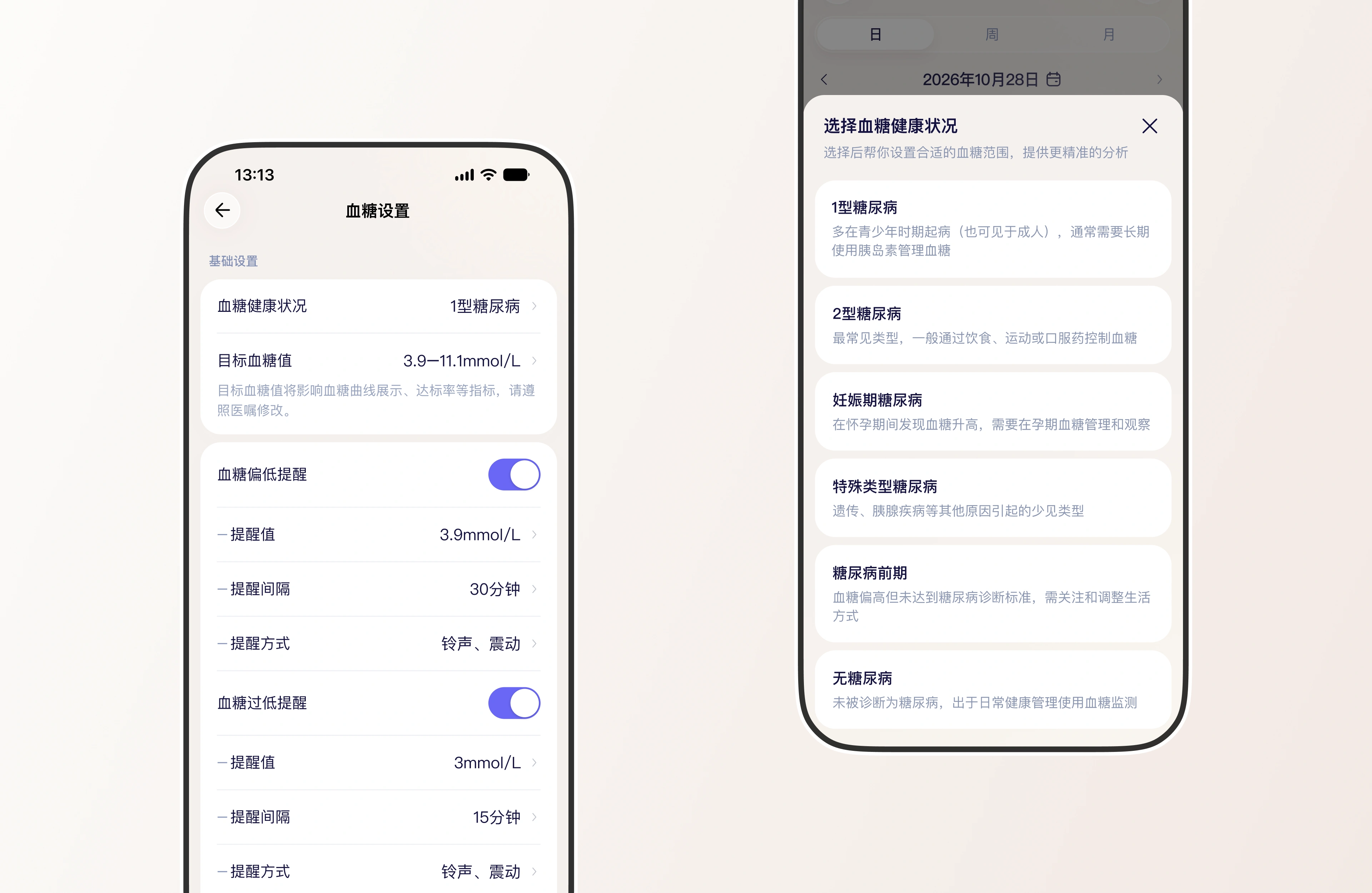
同一个 7.0,对 1 型糖尿病、妊娠期糖尿病和糖尿病前期意味着不同处理,所以第一步是问:你是哪一型。选完才谈目标——3.9 到 11 的目标值直接影响曲线配色和达标率算法;低于 3.9 和 3.0 分两级提醒,间隔 30 与 15 分钟,方式为铃声加震动。参数交给医生定,界面只负责让它看得懂、改得动。
The same 7.0 means different things for type 1 diabetes, gestational diabetes and prediabetes, so the first step in the glucose module is a question: which type are you. Only then come the targets — a 3.9 to 11 range that changes chart colouring and the time-in-range calculation, with two alert levels below 3.9 and below 3.0, at thirty and fifteen minute intervals, by ringtone and vibration. Doctors own the parameters; the interface only has to make them legible and editable.
档案即病历
健康档案是这个产品与纯 C 端产品最不一样的地方。顶部一句「去授权同步您的院内就诊资料吧」,把门诊和住院记录直接拉进来,生成带来源标签的资料——「血压异常」旁边标明是门诊诊断还是住院监测。下面按疾病史、用药史、过敏史、个人史、家族史五栏陈列,配 BMI、血压、血糖和身高体重;不会打字的老人可以直接「档案修改,和呦呦说」。数据来自医院,所以它才可能被医生采信。
The health record is where this product parts company with a purely consumer app. A single line at the top asks the patient to authorise syncing of hospital visits, and outpatient and admission records come straight in, each tagged with where it came from — an abnormal reading marked as diagnosed in clinic or observed during admission. Below, five columns cover medical history, medication, allergies, personal habits and family history, alongside BMI, blood pressure, glucose, height and weight. Someone who cannot type can simply say the change out loud. The data comes from the hospital, which is exactly why a doctor can trust it.
设计原则
| 结论即动作每一条结果都带下一步:就诊、复查、记录 | 数据有出处院内记录与设备读数分级,能追溯才被采信 | 少打一个字语音优先、卡片优先,老人也能独立用 |